


When we designed the Olympic Colour Café in Centurion, the project began with a simple question: What if paint was no longer just a product, but a medium for experience?
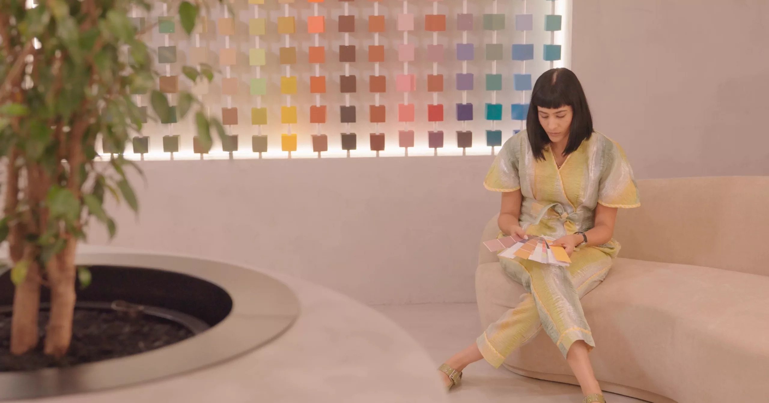
The project became an exploration of thresholds: between retail and exhibition, product and atmosphere and choosing colour and experiencing it.
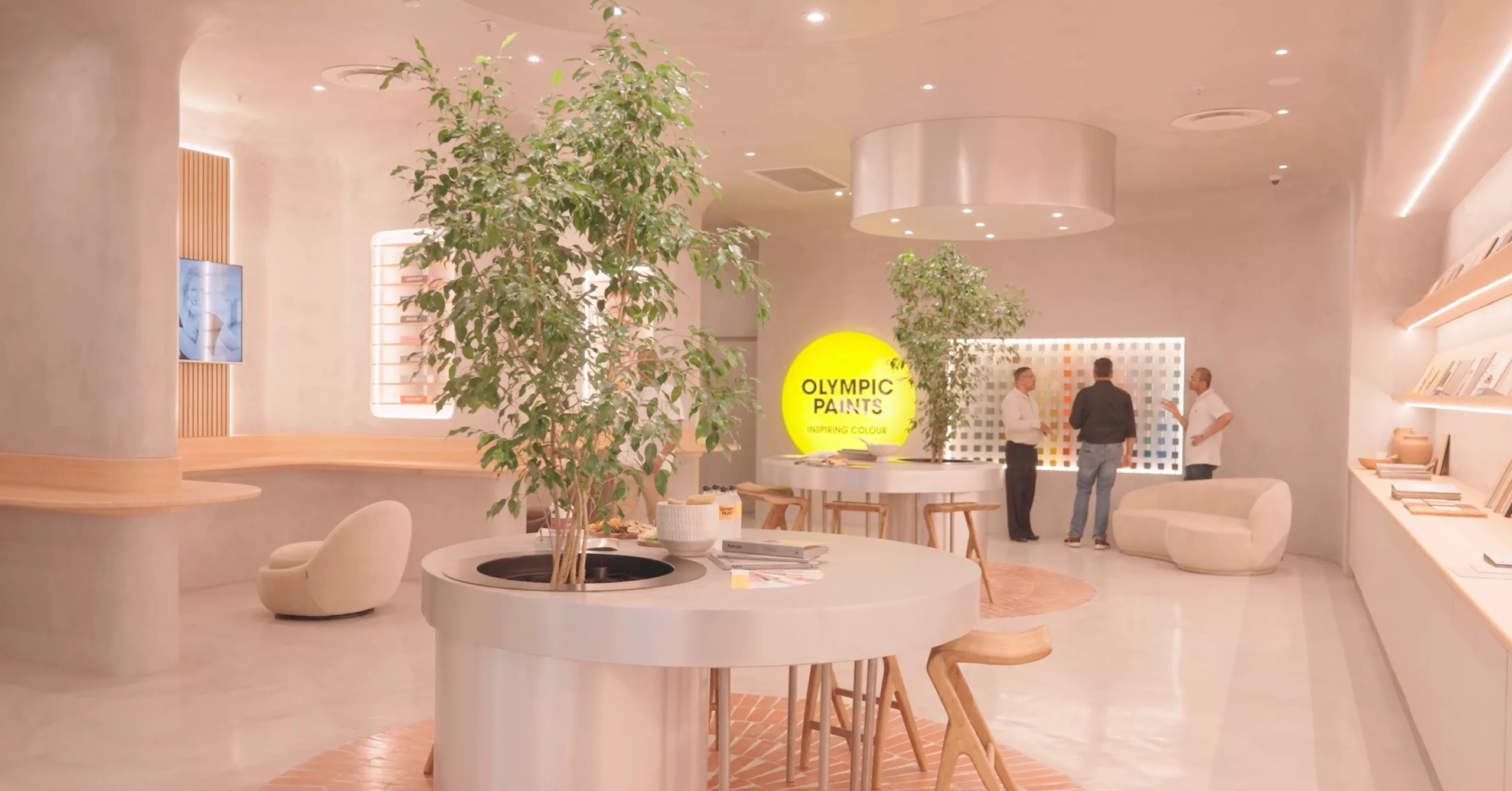
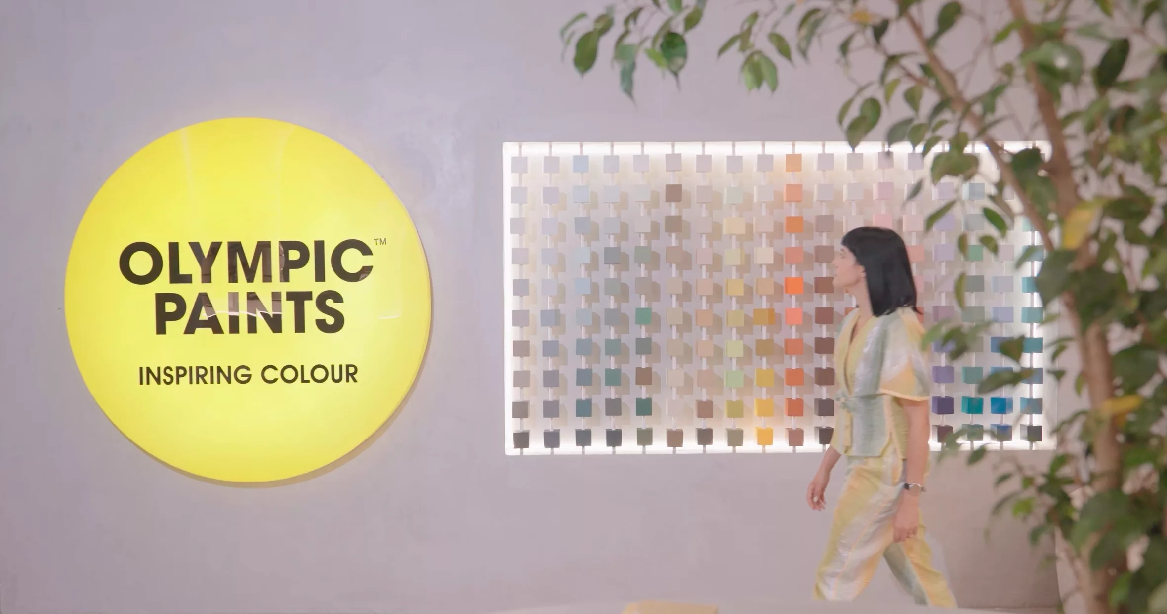
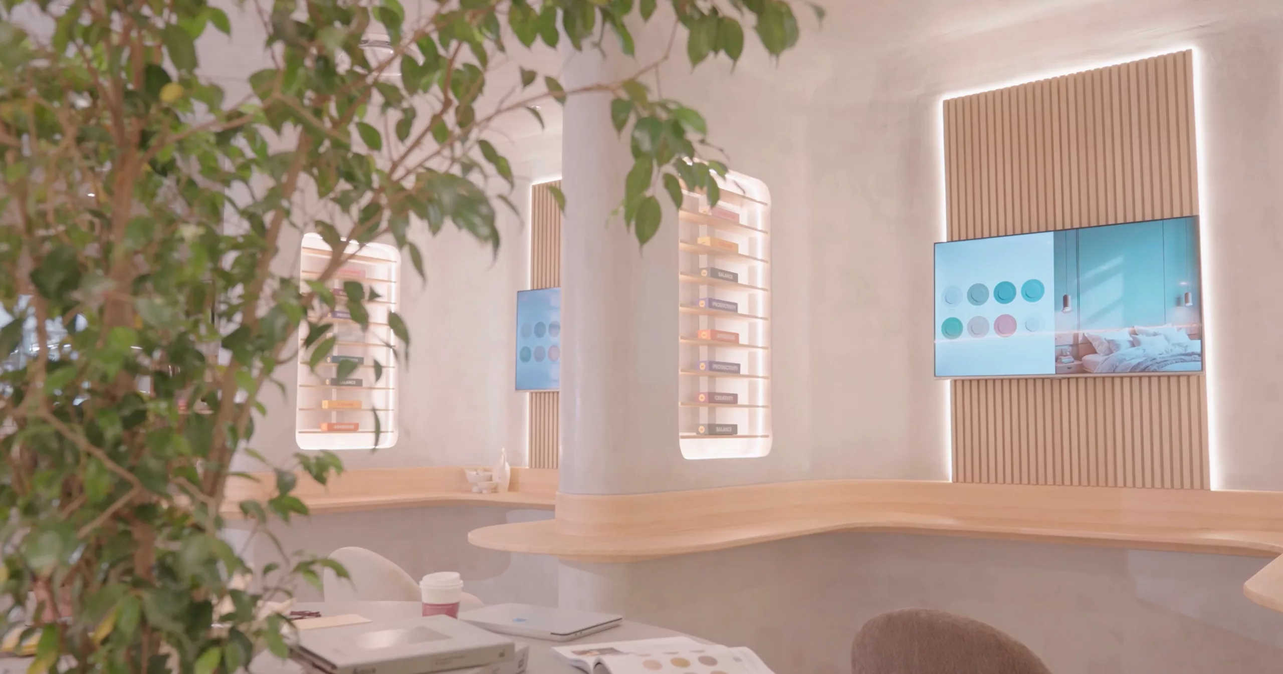
This resulted in a store that was part gallery, part workshop and part café. A living laboratory where technology, creativity, and everyday ritual intersected. The Colour Café was built on the permission to colour outside the lines. Since colour is never just visual, the architecture of the space needed to translate that sensory experience through materiality.
Stucco plaster walls created a quiet canvas to display the colour swatches. Klompie brick paving anchored the space in warm earth tones. Stainless steel counters introduced reflection, while raw timber shelving and living trees reconnected the interior to the natural world. This calm material palette allowed the seasonal colour narratives to shift over time while the architecture held steady.
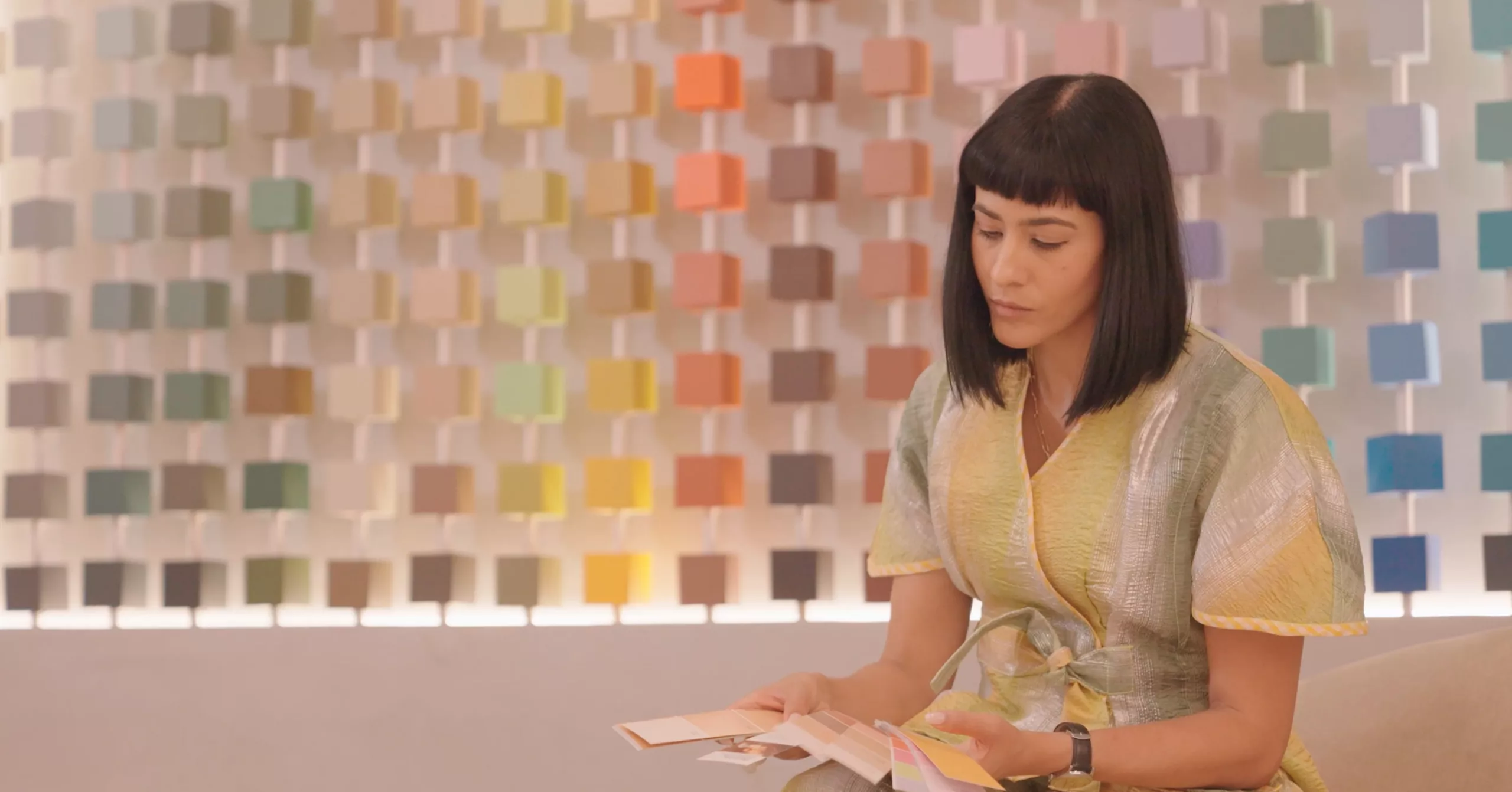
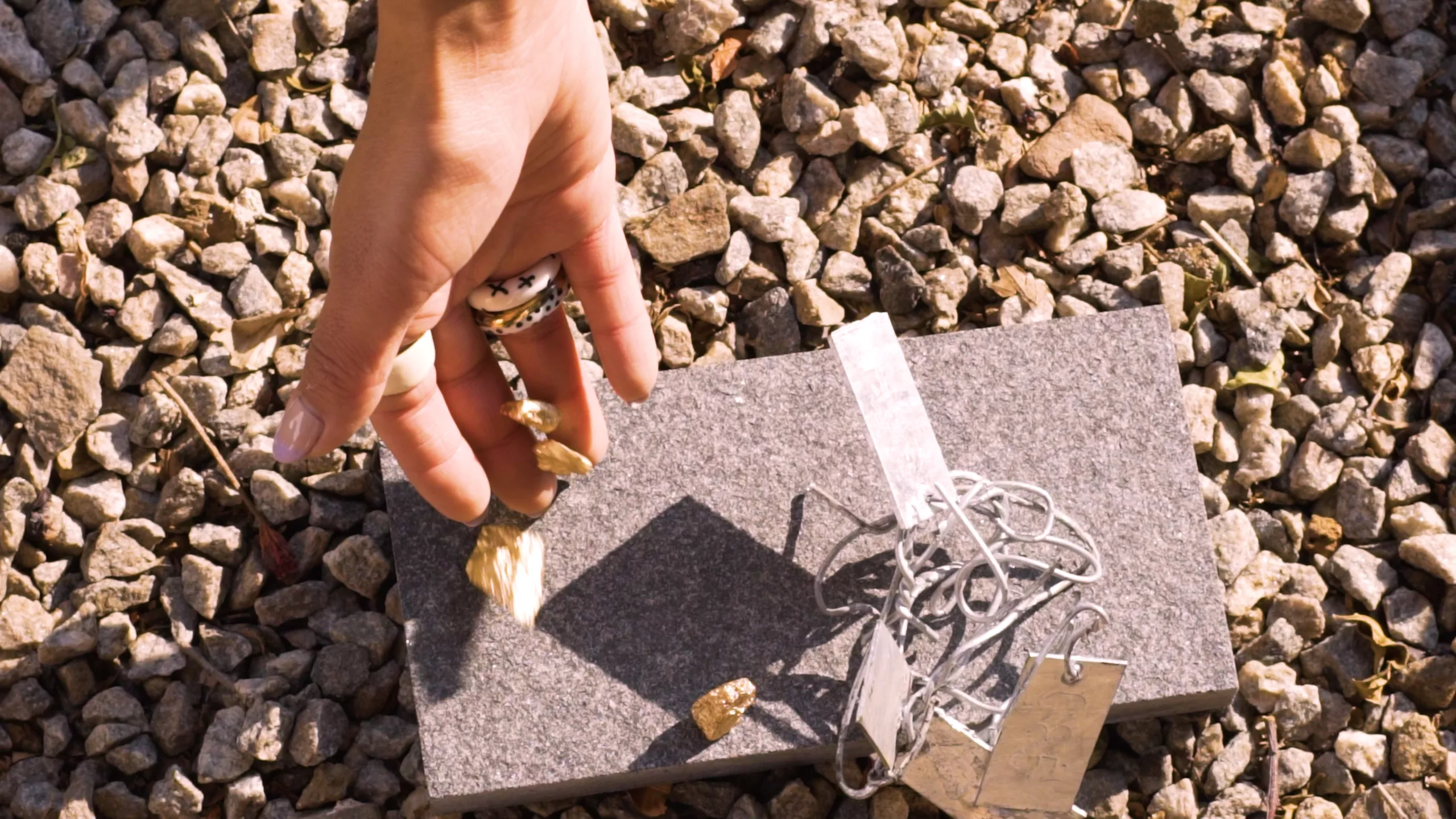
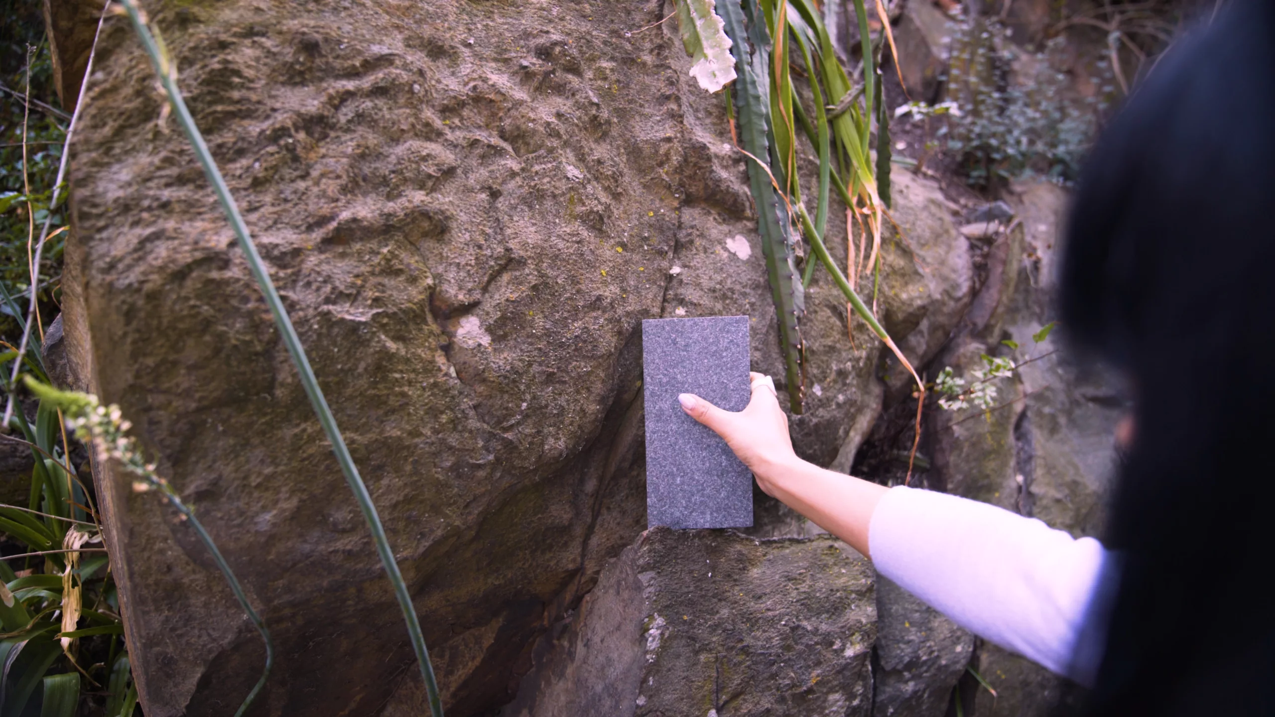
The first seasonal story, Fieldwork #1: Joburg Geologies, drew inspiration from the mineral landscapes and layered earth tones of Johannesburg’s: iron-rich soil, highveld grasses, oxidised reds, dusty ochres. Colours that felt grounded, elemental, and deeply connected to place.
Nature colours outside the lines all the time and that was what we were chasing.
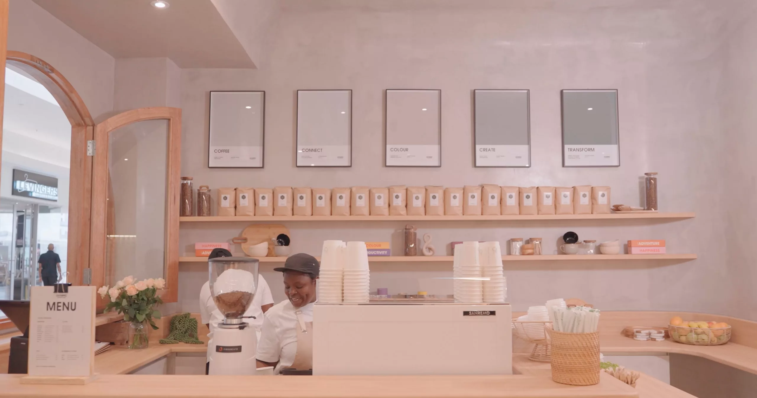
Even the coffee window became part of the design logic. It acted as a soft threshold, drawing people inside through something familiar and social. Seasonal drinks were developed alongside the palette stories, allowing colour to be experienced through taste, scent, and atmosphere.

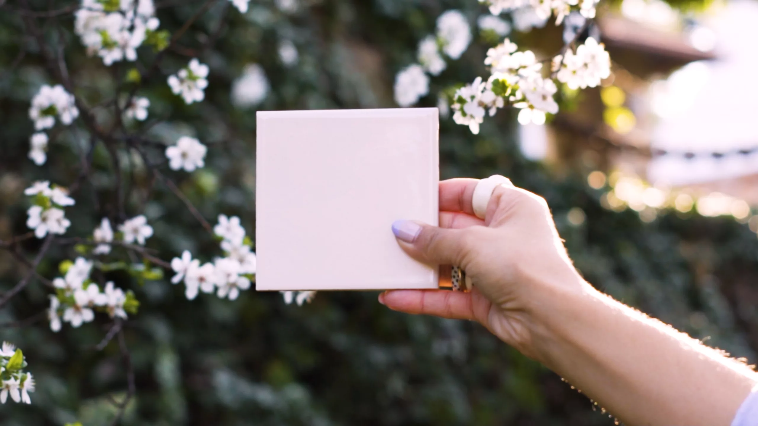
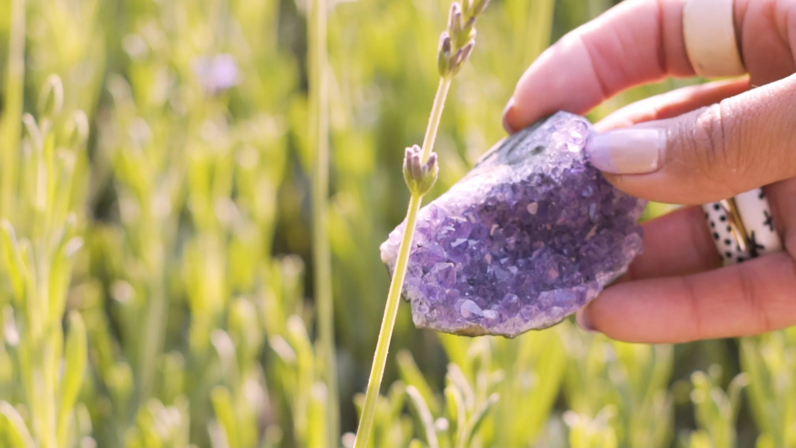
Colour became a way of reading the world, and an extension of our narrative, memory and mood.


